Launching Our New Look
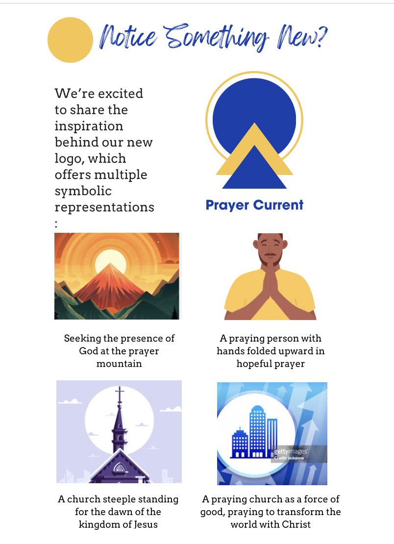
We’re excited to share the inspiration behind our new logo, which offers multiple symbolic representations:
In the North American evangelical church, the majority of the strong prayer ministries focus on devotional, private prayer. Our vision and voice is bold, prophetic, and hopeful, calling the church to rise up to an expansive robust kingdom vision of corporate prayer.
The new colors reflect this tone: yellow communicates light, hope, and a call to wake up to the power of prayer in a complex world. Blue is a stable color eliciting trust, yet the brighter hue is bold and shows depth, like deep waters.

As we trust God to open more doors for international partnerships leading to more translations, we have redesigned our logo and visuals to be based on simple geometric shapes in order to make them clearly reproduced in places with more limited technology.
The basic geometric shapes also reflect going back to the basics, calling the church back to the power of the gospel, prayer, discipleship and evangelism.

Even as simple as circles and triangles are, they are distinct from each other. And when combined, they create dynamic new images, representing growth and movement. The individual shapes, together, offer a foundation for future adaptations, just as we pray to remain sensitive to the leading of the Spirit.